
“I kind of feel like, more than anything, art – whether it’s a painting going to a gallery or somebody’s kid sister’s drawing – gives you the space to internalize things happening during the lulls.”
“One got the sense that everything she does is with purpose. A thoughtfulness, it seems, only artists have as they pick and mix colours on their palettes to paint their canvases.”
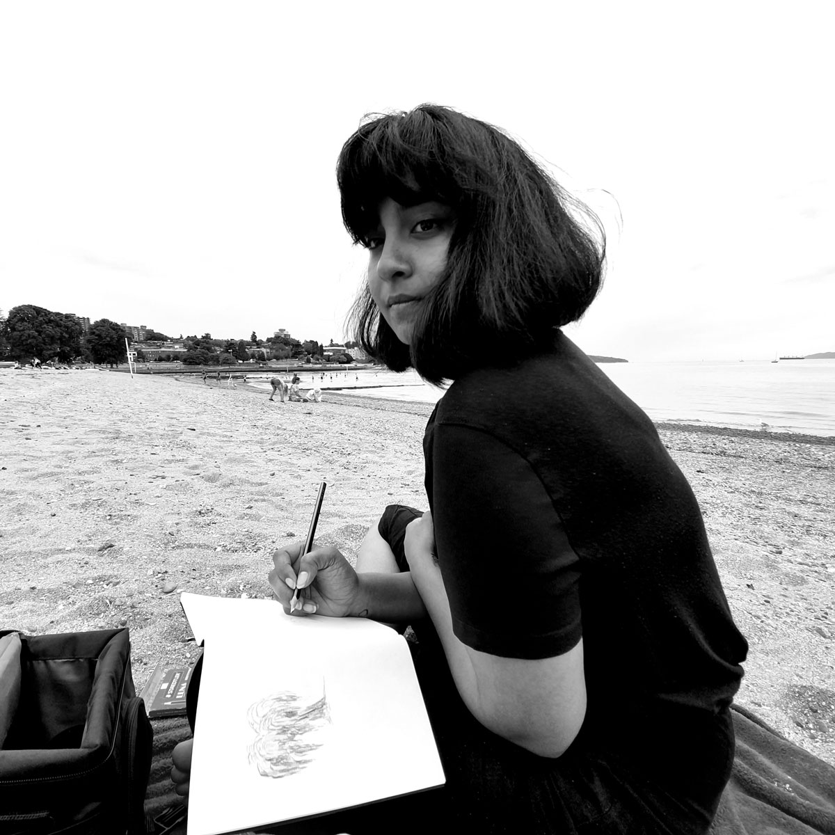
Nandita Ratan had an air of self-assurance about her. This was the first thing I noticed as we began our zoom call. One got the sense that everything she does is with purpose. A thoughtfulness, it seems, only artists have as they pick and mix colours on their palettes to paint their canvases.
We exchanged our stories – she grew up in India, and went to Srishti School of Art, Design and Technology for design – although if you ask her what her specific major was, she will burst out laughing, since apparently no one in Srishti knew the answer to that. She then came to Emily Carr University of Art + Design in Vancouver, where she graduated in May of 2020, right in the middle of the pandemic. I related to this, as I grew up in India and I am in Vancouver now for my education.
For her master’s thesis, Nandita investigated India’s shifting visual culture through the lens of matchbox labels. She deconstructed and created her own labels to experiment with visual language and its relationship to contemporary narratives in India and socio-political change. I was fascinated and asked her where she got the idea.
“Well,” she began, “I’m a very visual person, and I pull from the physical spaces around me. So when I was in India, it didn’t feel necessary to represent my culture in my work. It was only after coming to Vancouver, really, that I felt the need to ask, ‘How can I pull from the things I genuinely cherish?’ The chaos I knew, the sense of community I was accustomed to.” 
“Essentially, I studied all things old, took stock of where they’re at in the present, and hypothesised how they could be in the future. It started out with me studying nostalgia items: film posters, typography, any printed material, really. Then I narrowed down to the matchbox. For a lot of these things, the progression was really linear. I clearly saw the distinction between traditional movie posters and digitally-made ones. You could get the exact date to categorize them. But with matchboxes, I couldn’t make sense of it. They were so innocuous. But so important. We can’t get by without them in India.”
I fervently agreed. I remembered as a child scouring the entire house for one, needed for performing a prayer, and my mother disdainfully rejecting the lighter our neighbour offered us.
I thought about India’s history, and an inevitable question formed: can these matchboxes accurately capture that history? Do they show the lulls and larger moments, or are they more transitionary?
Nandita paused.
“I think I found some pretty clear distinctions based on how the printing looked, so I personally don’t think it was transitionary. We went from some pretty colonial-looking images, to this weird era between the 50s and the 90s, that just felt very quintessentially Indian? In a very born-and-brought-up way. And then there was this explosion of pop culture references, to kitsch images that made no sense! The matchbox would say the word ‘tiger’ but have a completely different image. It didn’t seem like they had a meaning at all.”
“In terms of transitions, some images were pretty specific, like it would have an actress’s face on it, or a freedom fighter’s. But, in general I think the practicalities of production, and catering to a market, would disallow a real-time factory or production house to make something that completely realistically alluded to a specific time in history. Because there are repercussions, you know, to how an image looks.’

Nandita has reckoned with that in her practice. “I put my art out in a very safe way, and only a specific type of person gets to see it. So I’m allowed to use my voice in whichever direction I choose. So I chose to make one about [Demonetisation in India], because I remember how angry it made me.”
Nandita was quick to acknowledge her privilege – of being a brown girl able to pursue exactly what she wanted, of being a higher caste in a country where casteism led to massacres, and of being given a beautiful, colourful voice to use without repercussions.
I thought about the pandemic we are in right now. In speaking of lulls, perhaps the most relevant is this one. So what happens when they are extended, or altered? How would art represent that?
“I kind of feel like, more than anything, art – whether it’s a painting going to a gallery or somebody’s kid sister’s drawing – gives you the space to internalize things happening during the lulls. For people who are constantly having open conversations about these lulls, these larger political instances, art is a spectacular way of keeping momentum.
“In the past, access to visuals certainly wasn’t as quick as it is now, with social media. So most of these lulls become an opportunity to take up space, or push our arguments forward. It’s easy for something like the US elections to overshadow something as important as BLM.” Social media is helpful in maintaining awareness of important things that could be overshadowed. “A lot of people say, ‘Oh God, but we’re in the middle of a pandemic, why’re you protesting?’ But that’s especially why you should be protesting. That’s essentially the use of what could have been a lull, in making it something so big, and so impactful.”
Nandita clearly had strong views on politics, having made pieces inspired by events in India as well. I asked her whether she thought her art had ever been successful in affecting someone’s view of politics.
“I definitely have had trolls, and I don’t know how actively I could change their view. Over time though, just the fact that there’s conversation happening is good, I think. There’s only so long someone can be in denial for. And sometimes, people do have rational responses, and at that point, I think it’s very important that whoever put that work out responds to them.”
As I absorb this, I go through her website. Her art is very illustrative, with bursts of colours making her pieces feel light-hearted. I ask her whether this is a choice — she nods, ‘Definitely a choice. I’m still trying to figure out my style, you know. A lot of my friends know what works for them, what they like doing. But for me, I realized I can’t stick to doing a single thing. In my undergrad, I started with ink, and that was so easy, so simple […] working with colour right now, it’s an active push to really focus on something I want to get right.”
I noticed that a lot of her pieces featured a dark-skinned girl with jet black hair and bangs, and it made me wonder whether she made herself the subject of her pieces often.
“Not on purpose. But I think that’s just for lack of realistic models around us. A lot of times, if you barged into an artist’s studio, you would see them making weird faces in the mirror.” She laughs. “My face is the first point of reference I have. But, I thought it was important that I show South Asian skin representation as well, and so it evolved into a conscious decision.”
 I stared at this sketch of a girl who looks like me, unsuspectingly carrying her groceries back home. The pastel colour scheme somehow romanticised the way I remembered India. Sometimes it is hard to appreciate my country. It is constantly fraught with tensions, riots, and people crying murder over things that, to the ordinary eye, do not seem to matter. But Nandita has a gift – she manages to capture the colours and vibrancy of India, and pick and choose poignant themes that make you feel nostalgic and hopeful simultaneously. Yes, art can be political; but even in that, art is emotion – emotion about the shows you watch, the books you read, the places you visit, and of course, the decisions that affect your country.